LA Times Studios may earn commission from purchases made through our links.
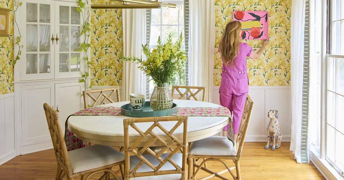
Wallpaper has always been the background character. Pleasant. Polite. The thing you put up when you needed a little something but didn’t know what. Lately, though, something more interesting is happening. Designers and homeowners are starting to treat wallpaper the way they treat art. Like curating a personal gallery.
A recent press release announcing the Chasing Paper x Liz Lidgett collaboration shows just how far that shift has come. The collection brings together nine artists, fourteen wallpaper prints, and seven art prints, all curated with the mindset of a gallery show rather than a décor line. It’s a reminder that we’re in our “art wall” era, moving beyond the “accent wall,” shaping the way design lovers approach their spaces.
RELATED: Looks Like Bold Stripes Will Have Their Moment in 2026
This trend isn’t happening in isolation. Brands like Artemest, House of Hackney, and Hygge & West have all pushed wallpaper into more expressive territory over the last decade. What Chasing Paper and Liz Lidgett have created taps into that same spirit and makes it even more accessible.
RELATED: How to Choose the Right Wallpaper With Expert Tips From Chasing Paper’s Elizabeth Rees
Why This Collection Feels Different
The collection feels like stepping into a modern gallery. The work is deeply varied. Quiet florals, abstract stripes, quilt-inspired geometrics, moody coastal scenes. Each artist contributes something distinct.

A geometric landscape design, featuring muted colors of blue, green, and terracotta
(Chasing Paper/Aly Ytterberg)
Aly Ytterberg pulls from Midwestern drives. Anee Shah paints quiet emotion into her botanicals. Bekah Worley leans into movement and abundance. Kevin Brent Morris zooms in on butterflies that feel both whimsical and elegant. Kristen Abbott introduces serenity through cyanotypes.
RELATED: Inside Pamela Anderson’s Farmhouse Holiday: Cozy Decor You Can Shop Now
Michele Aschenbrenner leans into joy through color. Racheal Jackson turns stripes into statements. Paige Barnes Dorsey brings her signature snakes with surprising softness. And Liz Lidgett contributes a watercolor stripe she originally imagined for her kids’ playroom.
RELATED: Why Is Everyone Talking About Biophilic Design?
The combined effect feels like a curated exhibition where every artist contributes something unique, yet the entire collection makes sense together. It’s the same kind of coherence design lovers appreciate in the mood-driven maximalism of House of Hackney, but with a lighter, more mixable touch.

(Chasing Paper/ Liz Lidgett)
A Home That Flows, Not Matches
Designers talk constantly about continuity… the way a house feels when you move through it. And this collection seems built for exactly that. The palettes shift from moody blues to warm florals to bright pastels, but the sensibility stays connected. You’re building a progression, not just repeating the same thing everywhere.
Bedrooms can take the softer tones. Entryways can handle the bolder prints. Powder rooms always love a moment. And the art prints make transitions feel intentional rather than abrupt.
This is where the “art wall” feels different from the old idea of a gallery wall. It’s not about a cluster of frames. It’s about using the wall itself as the work.
RELATED: Recreate Kourtney Kardashian’s Oversized Look in a Small Living Room
What’s Trending in Home Design & Decor
How to Use Collectible Wallpaper at Home

Chasing Paper / Bekah Worley
(Abstract floral daisy painting in white and bright pink, on a burnt orange background)
Start with one emotional anchor. Pick the print that makes you feel something. Maybe it’s a landscape that sparks nostalgia or a stripe that feels energizing. Even a floral that calms the room.
Use art prints as bridges. Each wallpaper has a complementary art print. Hang the print in a hallway, entryway, or landing to connect two rooms that use different wallpapers or paint colors. It gives your home a quiet through-line.
RELATED: Monogrammed Napkins Are Back, and Your Dinner Parties Will Never Be the Same
Think in transitions, not rooms. If you choose a bolder wallpaper for a powder room, echo one of its supporting colors in a nearby room. A quiet bedroom wallpaper with soft blues pairs beautifully with a more expressive living space.
Let pattern scale do the work. Large-scale patterns create atmosphere. Small-scale patterns add texture. Obvious but important. Use the scale to decide where the eye should land when someone steps inside. Getting the scale right is an instant design decision that does a lot of heavy lifting, so you don’t have to buy more stuff.
Treat it like art (because it is). If a print feels too precious to cover an entire room, use it on one wall and balance it with neutral paint on the others. You still get the emotional impact without overwhelming the space.