“My personal approach to design is based on my belief ‘less is more’. I always try to reduce a given problem to the essential rather than dress it up,” Fred Troller once said of his practice, according to an introduction by Steven Heller in a new book on the late Swiss designer. However, if that suggests there is no space for moments of expressive flair, the book demonstrates otherwise.
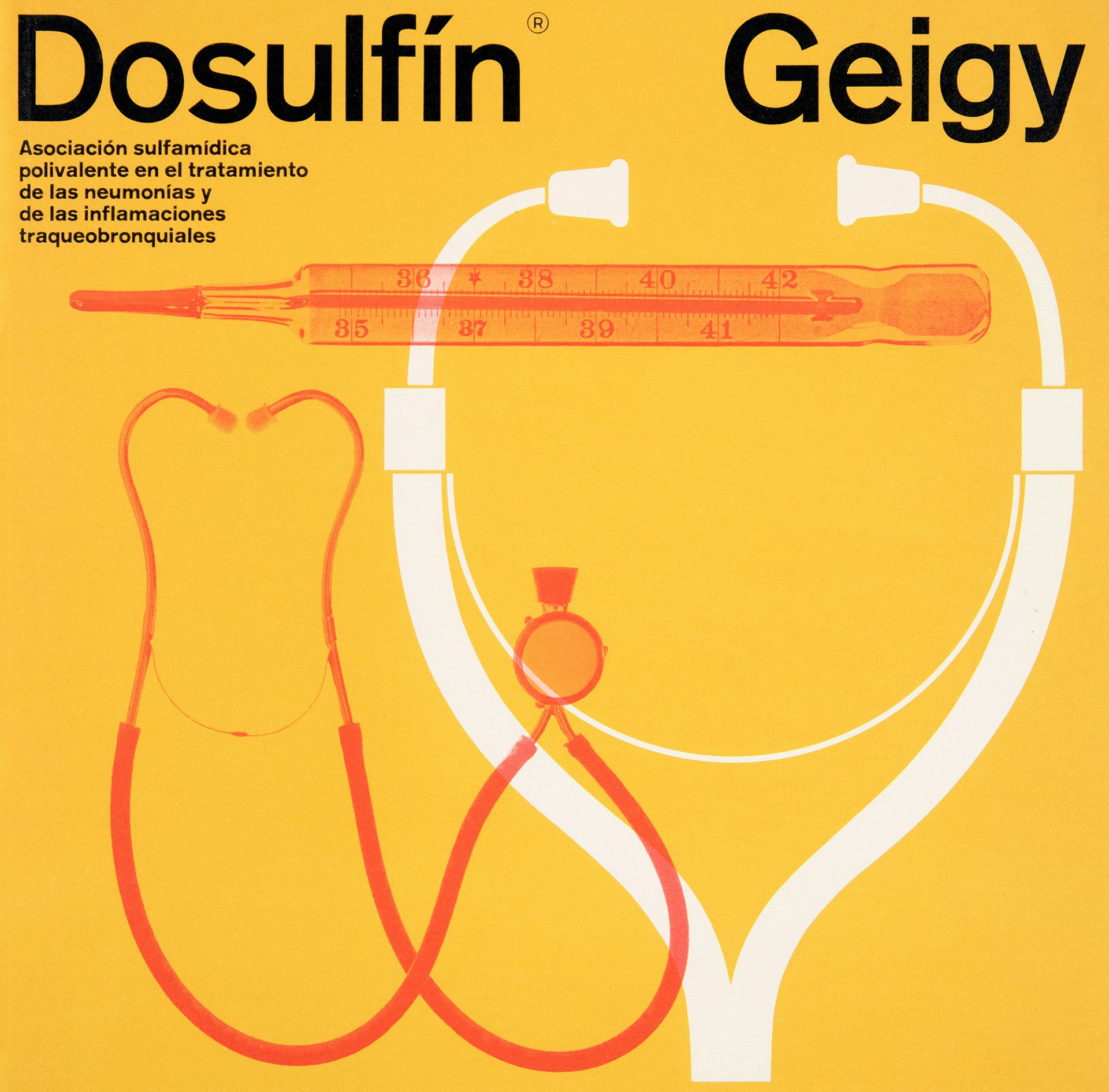
Among the more notable chapters in his five-decade career in design is Troller’s work with the Swiss pharmaceutical company Geigy during the 1960s, where he is credited with bringing an experimental energy to the brand’s posters and print ads, brochures, journals, packaging and in-house magazine, Catalyst. The approach to photography and graphic treatments seen in many of his designs from this time is remarkably striking, such as the starkly lit, high contrast images of bones for an anti-inflammatory drug.

“He had an excellent feel for emerging art trends and it was therefore easy and natural for him to integrate this new attitude to life into his work and that of his team,” Karin Gimmi notes in the book. His legacy as the art director of the New York branch of Geigy didn’t go unnoticed, earning the attention of several exhibitions in the 1960s and helping to spawn an entire graphic legacy of its own, known as ‘Geigy style’.
Troller left to open his own eponymous design company that attracted commercial clients in IBM, Polaroid and American Airlines, which involved creating a series of evocative typographic posters for the airline company in 1969 that employed a motion blur effect. Speed is something airlines today still try to evoke, but rarely is it depicted quite so stylishly as those posters.


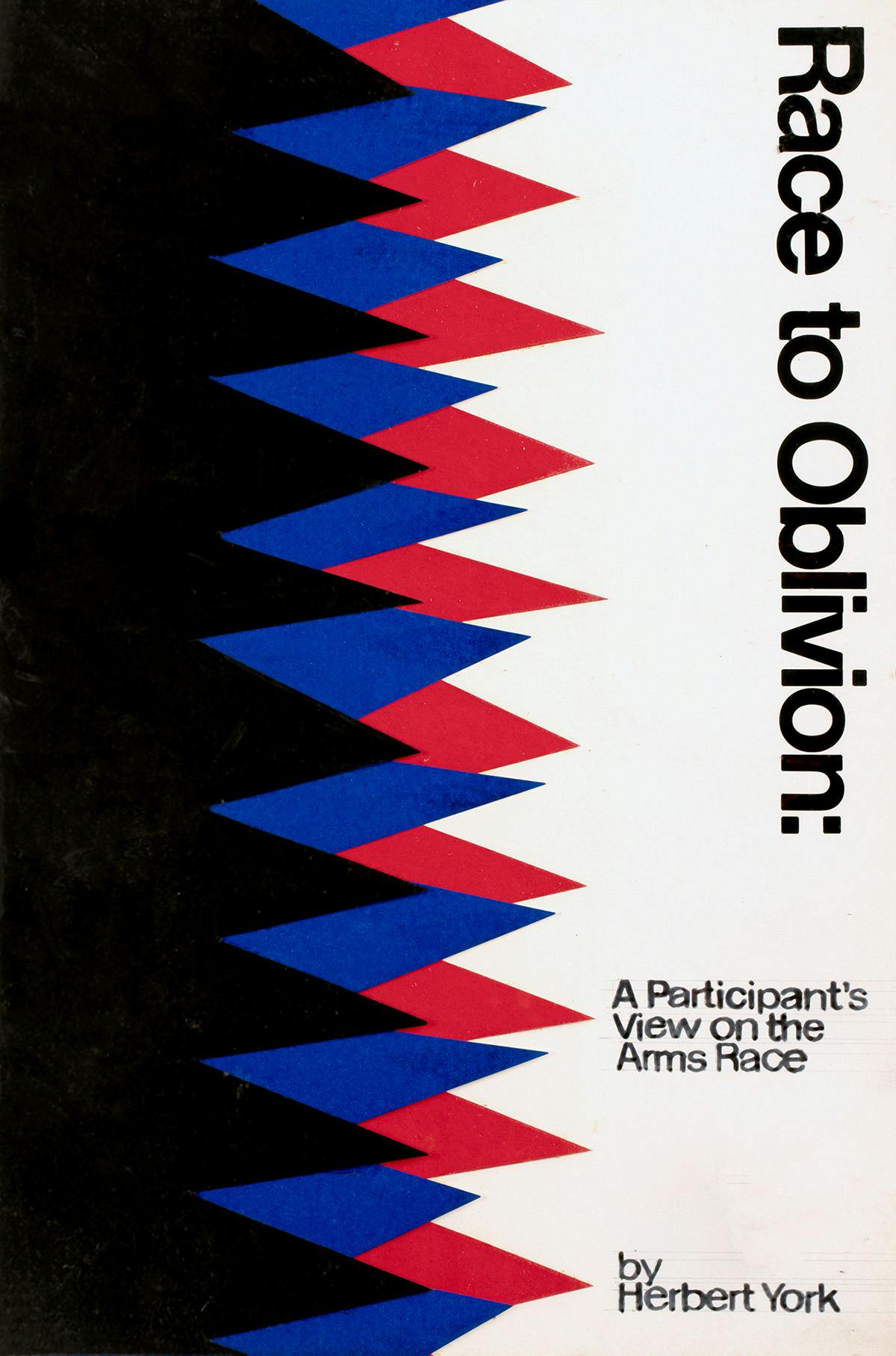
Alongside corporate clients, the agency also cultivated strong relationships in the world of editorial design with publishers like Anchor Doubleday, Random House and Simon & Schuster, for which he created a slew of “Stateside, Swiss-inflected” book designs, as Mark Owens puts it in the book.
Although his paperback covers feature bold shapes and high contrast palettes, there is a kind of organic tactility to the graphics he created for them, too. As well as his final designs, the book also features a collection of his cover mock-ups. Often bearing meticulously hand-rendered lettering and graphics, the mock-ups are a reminder of Troller’s commitment to craft, even for designs that weren’t intended to see the light of day.
Book cover mock-up

Book cover design for Doubleday Anchor

Book cover mock-up

Book cover design for Doubleday Anchor
“Like many Swiss designers, Troller maintained a lifelong fine art practice, and many of the forms that began as artworks made their way into commissioned work,” Evans writes. The proximity between the two disciplines was perhaps unavoidable: joined to the Troller Associates office in Port Chester, New York was his fine art studio, the two spaces connected by a yellow spiral staircase he built himself, his daughter Meret recalls in the book.
At the end of the book is a collection of personal and professional testimonials contributed by fellow designers, from Paula Scher to David Carson. It also contains an unspoken yet poignant testimonial by another graphic design great: Paul Rand, whose headstone was designed by Troller, a good friend. As Heller writes, “The monument bespeaks Rand’s faith in aesthetic simplicity and Troller’s devotion to it as well.”


Fred Troller Design is published by Unit Editions; uniteditions.com