When it comes to redecorating your home, it’s the finishing touches that make the biggest impact and tie all of your thoughtful design choices together. And aside from soft furnishings and window dressings, the part where personality is imparted that can make the biggest difference, and that’s within the artwork and pictures you choose to hang. Your home is a canvas, after all, and what better way to express your personality than through the art you choose to display?
Adding those warm and inviting pieces that offer a talking point and allow you to share your most treasured memories, styling your artwork isn’t just about choosing pretty pictures; it’s also about how you frame them, arrange them, and where you place them in your home. And it’s worth taking the time to consider this carefully so that you can ensure you get it just right.
Whether you’re showcasing cherished family photos or striking professional pieces, thoughtful décor choices have the ability to elevate your interior design game significantly. If you need a little help with this then read on as we take a look at some effective design tips that will help you create stunning visual displays with frames that truly shine.
Frame style and colour
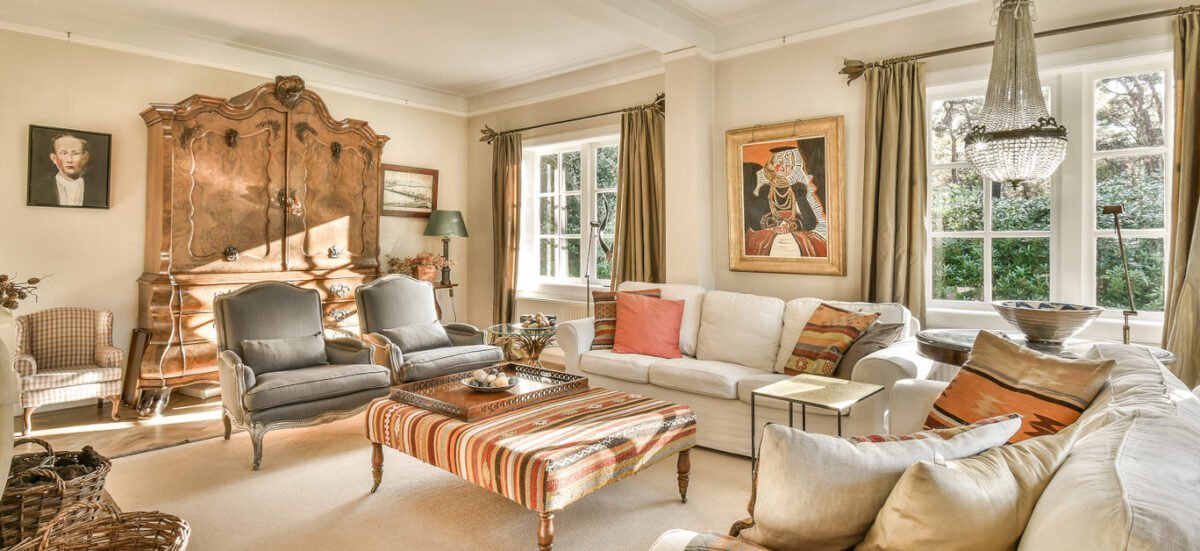
The frame you choose can make a world of difference in how your artwork is perceived acting as a bridge between the piece and its surroundings and enhancing or distracting from the visual experience.
Consider the style – a sleek metal frame adds a modern touch, while ornate wooden frames evoke warmth and tradition. Match the frame to both your art and overall décor for harmony.
Colour plays an equally crucial role with neutral tones like black, white, or natural wood allowing vibrant art to take centre stage, while, on the other hand, bold colours can complement specific hues within your artwork and create striking focal points.
Don’t shy away from mixing styles either as eclectic combinations of frames can add character and depth to your gallery wall, infusing personality into every corner of your home.
Content – personal photography to professional art
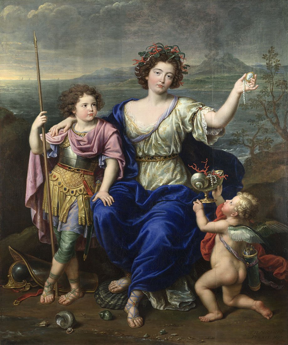
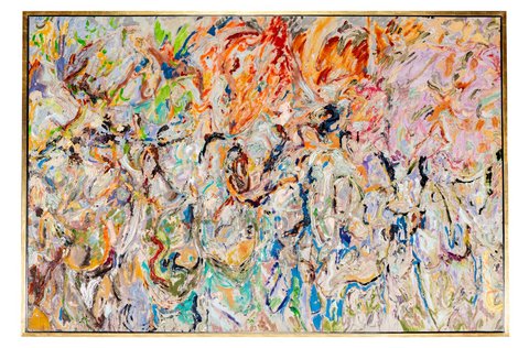
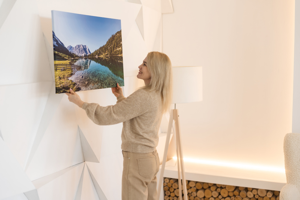
When it comes to decorating your walls, content matters immensely. Personal photography adds a unique touch to your space, whether it’s cherished family moments or stunning landscapes from your travels, these pieces tell your story.
On the other hand, professional art brings a polished vibe into your home and it can introduce colour and emotion in ways that are sure to elevate the entire room’s aesthetic.

Mixing both types creates an engaging gallery wall. Consider how each piece resonates with you and choose photos that evoke joy and art that inspires thoughtfulness. This blend provides depth and character while keeping décor fresh and inviting.
Layout and the basic design principles
Creating a captivating layout for your artwork involves understanding basic design principles. Balance is key; it ensures that no single piece overwhelms the space, and this can be achieved through symmetry or asymmetry, depending on the vibe you want.
Consider contrast as well. Pairing different styles and colours can create visual interest that draws the eye around the room. Think about how each frame complements its content – this relationship often enhances both elements.
Don’t forget to consider rhythm in your arrangement to guide viewers naturally from one piece to another. Use spacing wisely to prevent a cluttered look while maintaining connection among pieces.
Harmony ties everything together. Choose frames that resonate with each other and with your décor style to create a cohesive look throughout your home without sacrificing individuality.

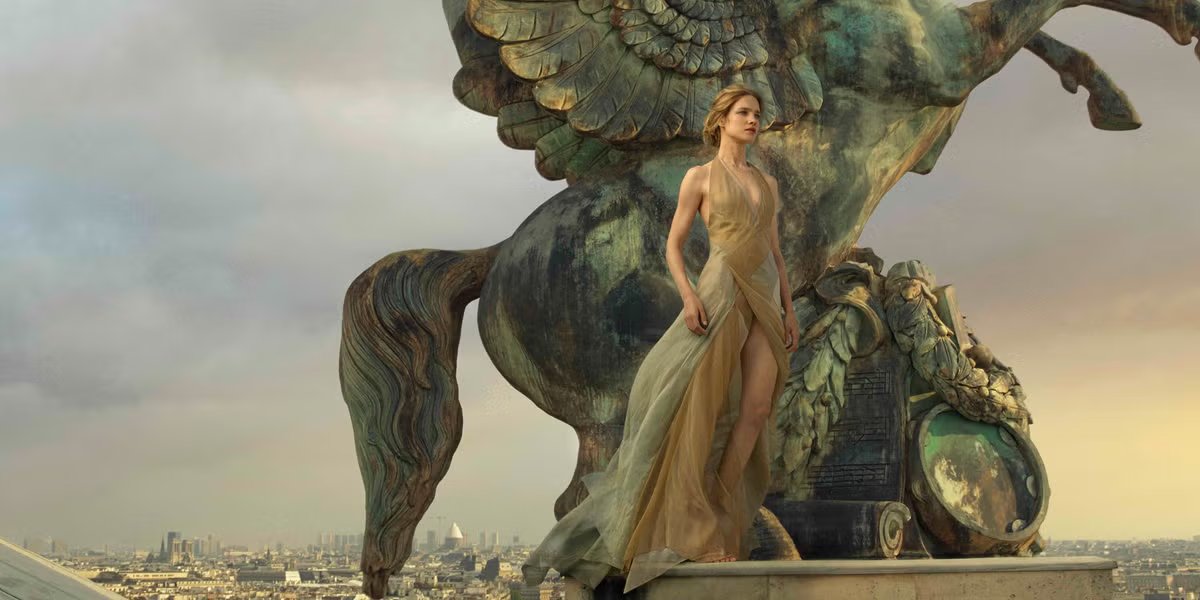
Size – go big or stay small
When it comes to size, bold choices, like frames 70 x 100, can make a striking impact. Large artwork serves as an anchor in any room as it draws the eye and creates a focal point that commands attention.
Conversely, small pieces offer subtlety and intimacy. They can fill nooks or create cosy gallery walls without overwhelming the space. A collection of smaller frames allows for character while showcasing your personal taste.
Remember to consider scale relative to your furniture and wall dimensions. Oversized art may dwarf a small sofa, while tiny prints might get lost on expansive walls.
Mixing sizes can also add visual interest, so consider combining large canvases with scattered smaller photos for depth and balance in your décor strategy.
Quantity
When it comes to quantity, think about how many pieces you want to display together, as a well-curated group can create a striking focal point in any room.
Consider arranging smaller frames in clusters. This approach allows for creativity and gives your décor character. Also mix and match shapes for an eclectic feel or opt for uniform frames for a more polished look.
Don’t overcrowd the wall; balance is key, so be sure to leave some space between each picture to let them breathe as this will prevent the area from feeling cluttered.
If you’re using larger artworks, fewer pieces are often more impactful. One bold statement piece can draw attention without competing with others.
Placement of your pictures
When placing your pictures, think about their relationship with windows and doors. Natural light can enhance colours but may fade artwork over time, and be sure to position art where it can be appreciated without glare.
Consider the space around furniture too – a piece above a sofa or console table creates visual harmony. And don’t forget about scale in relation to your existing furnishings. Large pieces can anchor a room while smaller works might add charm when grouped together thoughtfully alongside other decorative items like plants or bookshelves.
Lighting plays a crucial role as well – highlighting art with soft spotlights or wall sconces adds depth and drama to your décor. Just be sure to avoid harsh overhead lights that might wash out colours.