While it’s true that in the age of streaming the vast majority of people experience album artwork in tiny thumbnail form, it remains a visual medium fully capable of making an impact.
This year proved that a great sleeve can still stop you mid-scroll – whether through a single stark gesture, like a lone lotus flower refusing to wilt, or a suggestive photograph that knowingly blurs the line between female agency and the male gaze.
At a time when music consumption has never been more frictionless, it’s refreshing to see artists fighting to preserve the intentionality and tactility of album art. Several of our top picks make the case for the resurgence of physical media – not as ornamental nostalgia but as serious craft that transcends the flat dimensionality of traditional album packaging.
A portrait painted with Baroque rigour; a kaleidoscopic experiment rooted in indigenous traditions; a grotesque caricature posing urgent cultural questions – each one proves that design still has the power to expand a record’s emotional depth rather than merely decorate it. Here, in no particular order, are ten sleeves that did exactly that in 2025.
Who Is the Sky?, David Byrne; Label: Matador

For his latest solo album, Who Is the Sky?, David Byrne reunited with designer and co-creative director Shira Inbar to create a series of vibrant, kaleidoscopic visuals largely inspired by traditional indigenous costumes, masks and ceremonial outfits from across the world.
The resulting visuals, built around cloned and duplicated images of Byrne wearing a set of elaborate sculpted suits made by fashion designer Tom Van der Borght, feel at once folkloric and psychedelic, inviting the listener to pay even closer attention to Byrne’s genre-hopping, globally inflected sound.
Speaking to CR, Inbar revealed how the elaborate cover artwork was executed: “The patterns for the album cover and the individual songs were all made of duplicated images of David, gradually scaled up. It magnifies him, but it also camouflages him.”
Released with an accompanying poster, visuals designed around each track on the album, and as a special edition vinyl with a lenticular cover, Who Is the Sky? is another bold statement from a singular artist who continues to push the boundaries of design and sound.
Man’s Best Friend, Sabrina Carpenter; Label: Island
Sabrina Carpenter caused quite the stir with her seventh album, which catches the pop star in an apparently submissive pose on her hands and knees next to an anonymous male figure. The hair- and headline-grabbing image was taken by Bryce Anderson, who also art directed the album, and anyone familiar with their work will know that subverting gender identity and roles is par for the course for this photographer.
Call it cheeky, empowering, regressive, slyly satirical…. Whatever you think of the cover and the frankly exhausting controversy surrounding it – which Carpenter only added fuel to by releasing an alternate direct-to-consumer cover she teasingly described as “approved by God” – there’s no denying its power. And, let’s be honest here, it was always intended to generate as much media attention as possible.
As Taylor Swift and to a lesser extent Charlie XCX have proven beyond any shred of doubt in recent years, today’s pop stars are nothing if not brands, and Man’s Best Friend is ultimately proof that Carpenter understands hers better than most. The provocation and inevitable backlash is all part of the show, and it certainly doesn’t diminish from what was one of the year’s finer pop offerings.
Lotus, Little Simz; Label: AWAL Recordings
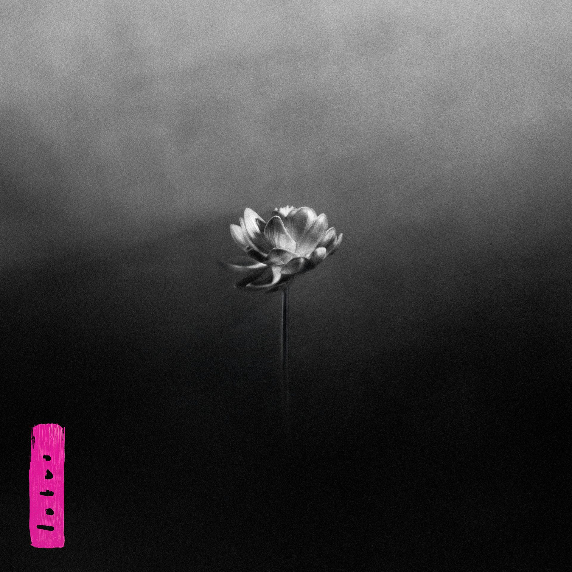
UK rapper Little Simz marked the arrival of her hotly anticipated sixth studio album with a still-life of a lone lotus flower. Developed with Brixton-based creative studio Yout, the design reflects a conscious decision to let the music’s emotional weight and narrative stand on its own.
As Simz’s long-time collaborator Jeremy Ngatho Cole told CR: “It was a response to a lot of stuff that she’d gone through the year before … I think it was a lot for me to react to, because obviously, she’s not just a collaborator, she’s a friend. And to hear someone who’s gone through stuff, it’s really difficult, but also it gave more purpose to everything that we wanted to do.”
In this context, the stark simplicity of the cover reflects that personal journey perfectly: like the music itself, the lotus flower represents something raw, vulnerable and real – a quiet bloom emerging from darkness. It’s a powerful example of how less can indeed be more.
Glory, Perfume Genius; Label: Matador
Shot by longtime collaborator Cody Critcheloe, the cover photo for Perfume Genius’ seventh studio album places frontman Mike Hadreas in a rather compromised position – sprawled on a floor surrounded by cables and patchwork carpet tiles, light filtering softly through a window behind him, as though frozen in a moment of existential unravelling.
Critics have called Glory “a capacious look at anxiety, grief and disconnection”, and that’s certainly the impression given by the cover. The wider album visuals stretch this idea still further, conveying a sense of fragmentation and worn-in familiarity through seemingly mundane domestic scenarios while hinting at a deeper emotional rupture.
Hadreas has said the shoot was partly inspired by Harmony Korine’s 1999 film Julien Donkey-Boy and Michael Haneke’s 2001 film The Piano Teacher, telling Uproxx: “A lot of things [Cody and I] talked about were not aesthetic, they were energetic. I sent him a whole long list of film scenes, but I didn’t want them to look like these film scenes. I wanted it to feel like the energy between the characters or what was going on.”
Golliwog, billy woods; Label: Backwoodz Studioz

Given the abrasive, unflinching manner in which US rapper billy woods tackles the everyday horrors of the Black experience on his latest album, it’s hard to think of a more fitting title or central motif than the eponymous racist caricature.
The cover, created in collaboration with longtime visual partner Alexander Richter, doesn’t attempt to soften or abstract the imagery. Instead, woods presents the golliwog figure head-on, its grin fixed and grotesque. In typical woods fashion, the decision reads less as provocation for its own sake and more as a deliberate act of confrontation, forcing an interrogation of the figure’s insidious role in shaping racial stereotypes.
It’s an uncomfortable image, but then Golliwog is not intended to be an easy listen. Across its runtime, woods nimbly dissects the mechanics of power, the violence woven into American life, and the toll of generational trauma. But what makes the artwork so effective is its refusal to offer catharsis.
There’s no attempt to reclaim or rehabilitate the golliwog here: Instead, woods and Richter freeze it in place, forcing a necessary reckoning with the history it carries and the systems that allow it to endure.
Private Music, Deftones: Label: Reprise Records
It’s been a strong year for venomous cover stars (shout out to Squid’s Cowards, which narrowly missed the cut), but there was one clear standout. Depicting a pure white snake against an electric green background, the cover artwork for Deftones’ tenth album is as unambiguous a signal of intent as you will ever see. This is music made to be played loud.
Of course, California’s favourite alt-metal sons have been here before – following on from 2000’s White Pony and 2010’s Diamond Eyes, which featured on their covers a pale horse and a barn owl, respectively, Private Music could be viewed as the completion of an unofficial white animal trilogy (or perhaps even a quadrilogy, given that 2016’s Gore features a flock of pink flamingos, which are, of course, born white).
Real heads will no doubt be aware that White Pony’s cover is an homage to Hum’s 1995 album You’d Prefer an Astronaut, and it’s quite possible that Private Music is another, given its prominent use of green. In fact, both covers were produced by legendary designer Frank Maddocks, VP creative services at Warner Bros, who has worked with the band on every album since their 2000 breakthrough.
And the Adjacent Possible, OK Go; Label: Paracadute
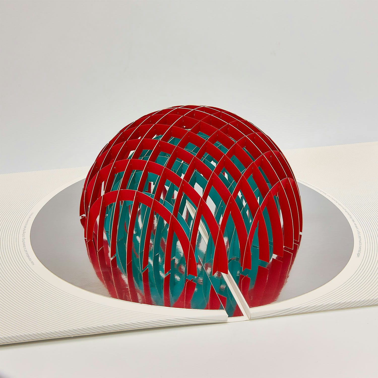
OK Go have long been known for their uncanny ability to turn pop-rock into visual spectacle. With their latest record, And the Adjacent Possible, they pushed that ethos into the realm of physical design.
Instead of a flat sleeve, the album arrives as a fully functioning pop-up book: open the gatefold and a three-dimensional shape rises up. “As physical media becomes more niche, enhancing its decorative and collectible value feels both meaningful and timely,” frontman Damian Kulash told CR.
Designed by Yuri Suzuki and Claudio Ripol of Team Suzuki (with paper-engineering by staff at greeting-card company Lovepop), the sleeve is built around the album’s conceptual theme of “interconnected potentialities”. The mirrored finishes, symmetry and geometry create an illusion of evolving form – a visual metaphor for growth and transformation.
Essex Honey, Blood Orange; Label: Domino
For his first release as Blood Orange since 2018’s Negro Swan, multi-hyphenate Dev Hynes reached out to British photographer Johnny Pitts enquiring about an image from his 2021 project Home is Not a Place, a travelogue exploring Black British identity made in collaboration with Roger Robinson that was first shown at the Photographers’ Gallery in London in 2023.
The photograph in question, showing a student walking home – basketball in one hand; phone in the other; school tie held aloft by the breeze – neatly encapsulates the tone of Essex Honey. As Pitts explained on his Instagram page around the time of the album’s release: “As soon as Dev reached out and sent the masters … I understood completely how the two works matched – both in turns mellow and melancholy, moody and gentle, dreamy and wistful.”
Hynes has described Essex Honey as his most personal album so far – it was written following the death of his mother in 2023 – and like the image of the young man on its cover, it appears to captures a moment in life that feels both fleeting and indelible, imbued with a sense of quietude and longing.
He has used photography on every Blood Orange album to date from a variety of sources, notably borrowing from Bill Butterworth for 2013’s Cupid Deluxe and Deana Lawson for 2016’s Freetown Sound. This is yet another fine example of how a record sleeve can extend the life of a piece of creative work beyond its initial context.
West End Girl, Lily Allen; Label: BMG
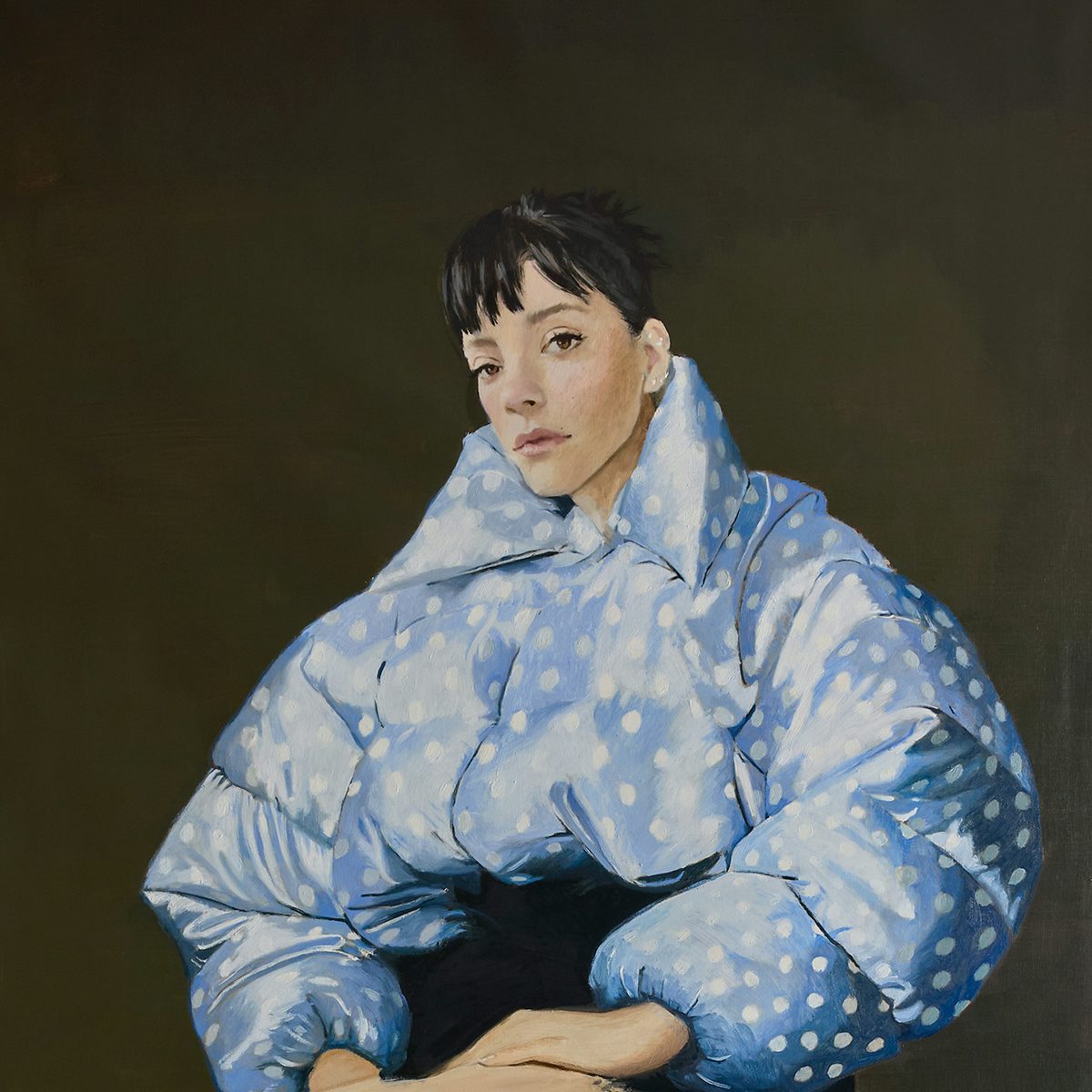
For her long-awaited return in 2025, Lily Allen turned to Spanish painter Nieves González to create the cover art for West End Girl – a portrait that calls on the grandeur of 16th- and 17th-century painting while firmly rooting itself in 21st-century female experience.
The result: Allen seated in a polka dot Miu Miu puffer jacket and matching Valentino knee-highs, her gaze calm and direct; classical in pose but resolutely modern in execution. On the record itself, which was reportedly inspired by the narrative structure of The Streets’ A Grand Don’t Come For Free, Allen delivers a candid autobiographical chronicle of betrayal, heartbreak and redemption across 14 musically eclectic tracks.
West End Girl is thus a break-up album for modern times, anchored by an image as composed as the lyrics are chaotic. It is at once a visual and sonic rebirth, poised and flawed and messy and entirely real.
Rather than merely distilling the story and mood of the album, the portrait is a reflection of González’s long-standing fascination with Baroque paintings by Spanish painters such as Francisco de Zurbarán and Jusepe de Ribera. As she told CR: “The cover spoke entirely of me and what inspires me…. Everything flowed because the pictorial language fit perfectly with what [Allen and creative director Leith Clark] were looking for.”
The Spiritual Sound, Agriculture; Label: The Flenser
With shades of Carl Theodor Dreyer’s landmark silent film The Passion of Joan of Arc (1928) and Gian Lorenzo Bernini’s sculptural masterpiece The Ecstasy of Saint Teresa, the cover artwork for Agriculture’s The Spiritual Sound is loaded with religious symbolism.
The highly stylised black-and-white image, created by photographer Olivia Crumm, also perfectly captures the “ecstatic black metal” promised by the Los Angeles-based group on the second full-length release, shaped by the vision of its two principal songwriters, Dan Meyer and Leah Levinson.
Yet, per the press release for the album, “even in its most ambitious moments, The Spiritual Sound remains rooted in the ordinary and in the day-to-day relationships between the people who made it. Gas station snacks. Inside jokes. Sleeping on floors. Playing shows in rooms that smell like mildew. The spirit here isn’t abstract, it’s live.”